


Overview
I worked on this project as part of the UX Course within The Informal School of IT. The work was carried out over a four-month period and it was split into two main phases: the team research, where we focused on getting to know the users of our product, and an individual design stage where I created the wireframes and the product prototypes, accordingly to what I learned in the research phase.
Our project's goal was to redesign the self-checkout experience of a specific Supermarket to meet both customer and business needs. My team decided to choose Kaufland because it is a large supermarket in Romania, that has at least one store in the cities we are from (Bucharest, Iași and Baia mare).
The business needs were to increase the usage of the self-checkout terminal at minimal costs and to reduce the interactions with the staff.
Our Team
The research team consisted of three members. We had ar least one Zoom meeting a week where we brainstormed, discussed new ideas and assigned tasks for the following meet up.
Our roles were:
Sebastian: Facilitator & Implementor
Alina: Storyteller & Resource Investigator
Ana: Spokeperson & Data Collector
Our project limitations were that we have full-time jobs or children and because of that we could work on the project mainly in the late evening. Other limitations that we faced were that we live in different cities and that none of us had ever done an UX project.
Design Process
Research
Our research goal aimed to understand the costumers' behaviour and what aspects of this whole process needs to be improved in order for them to have a better self-checkout experience (while taking into account the business needs).
Whit a view to our goal we asked ourselves questions like:
- Which are the reasons why a customer decides to use or not use the self-checkout system?
- How easy or hard is for a customer to figure out what actions are possible and where and how to perform them while using the self-checkout system?
- What feelings customers have while using the self-checkout system?
- How easy or hard is for a customer to figure out how to peforms some tasks while using the self-chekout system?
- What feelings and thoughts customers have while using the self-checkout system?
- Which are the customer needs when they use the self-checkout system?
We started by doing desk research and competitive analysis for a better understanding of the market. We found out that in Romania:
We also learned that the trend in supermarket industry in Romania, as in many other countries, is toward having more and more self-checkout terminals in the store or even building new stores with self-service checkout only. This shows us how important self-checkout system is and will be, it's presence being an important criteria for some when choosing where to do the groceries.
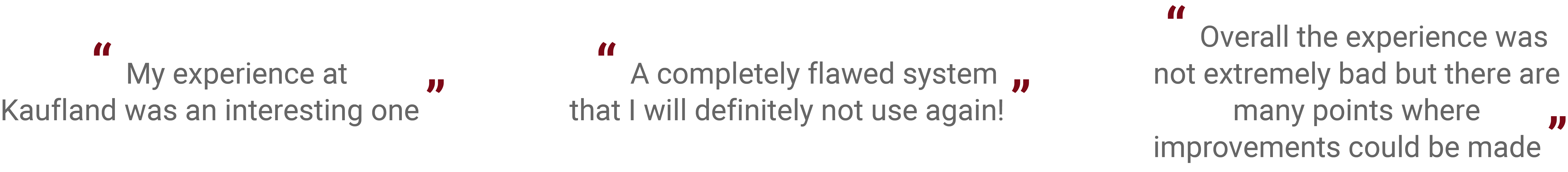
For the qualitative research we used different methods of research, such as: diary studies, direct observation and semi-structured interviews. We used these methods to discover the problems and the feelings people may experience when using the self-checkout terminals.
From the diary studies and the semi-structured interviews, we collected the user behavior data and the overall experiences. We also monitored the users activity which helped us to better understand the users.
Direct observation gave us an objective point of view on users behavior. We could also observe situations that users may consider as irrelevant and therefore they would not share them with us.
Self-checkout reviews
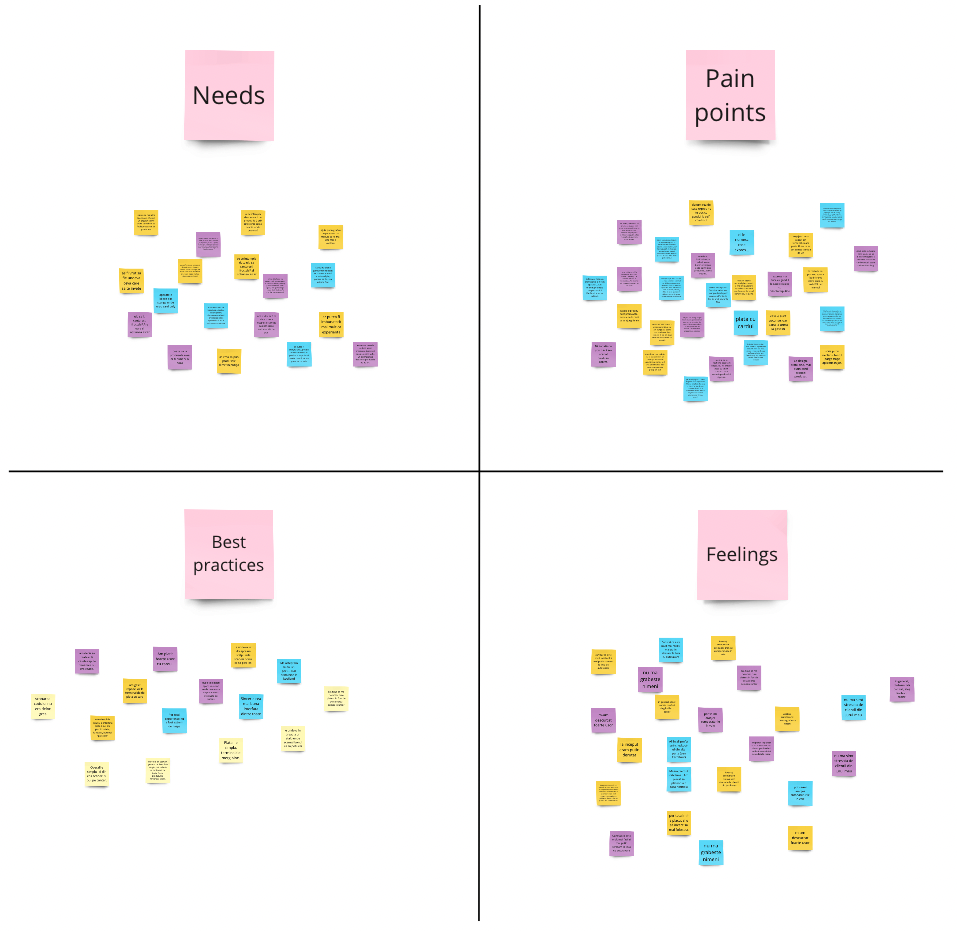
Affinity map
After completing the qualitative research, all team members read through all the diaries and interviews and highlighted the sections that were relevant to the research, then added those sections to online sticky notes. After this step, we categorized the sticky notes by needs, pain points, best practices and feelings and then we created an affinity map to analyze the data.
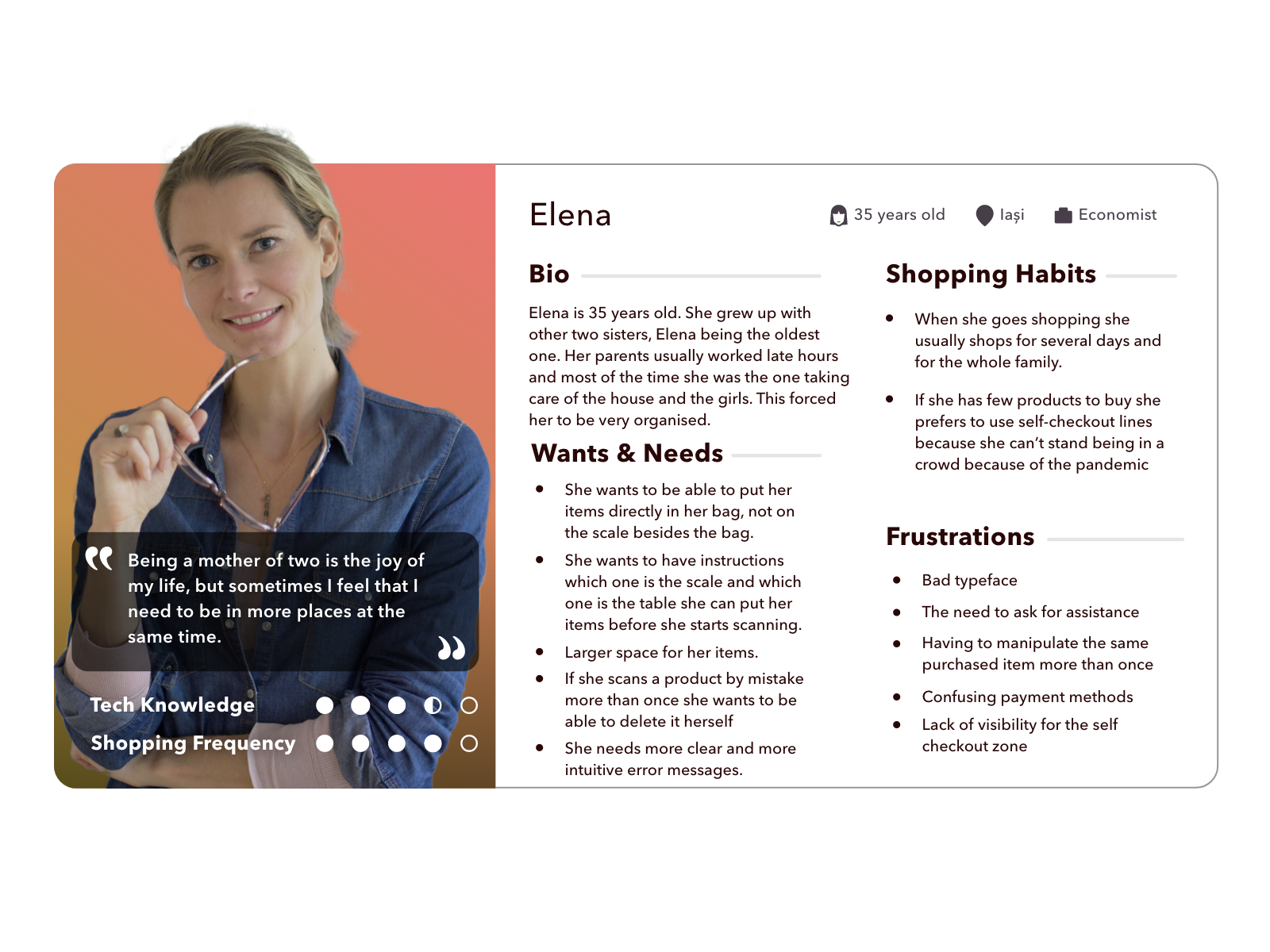
User persona & journey
The information gathered from the qualitative research and the affinity map helped us notice three main groups that behaved differently when using self-checkout terminals:
1. Young adults (from 18 to 30 years)
2. Middle-age adults (from 30 to 50 years)
3. Old adults (after age 50)
For each group, we then created an user persona and a journey.
User personas helped us find the answer to one of our most important questions, “Who are we designing this self-checkout system for?”. By understanding the expectations, concerns, and motivations of our target users, we had the possibility to design a product that would satisfy the users’ needs and therefore be successful.
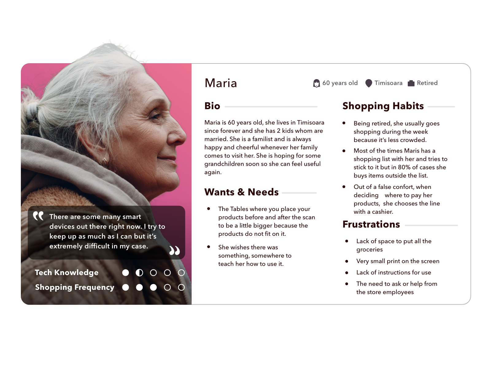
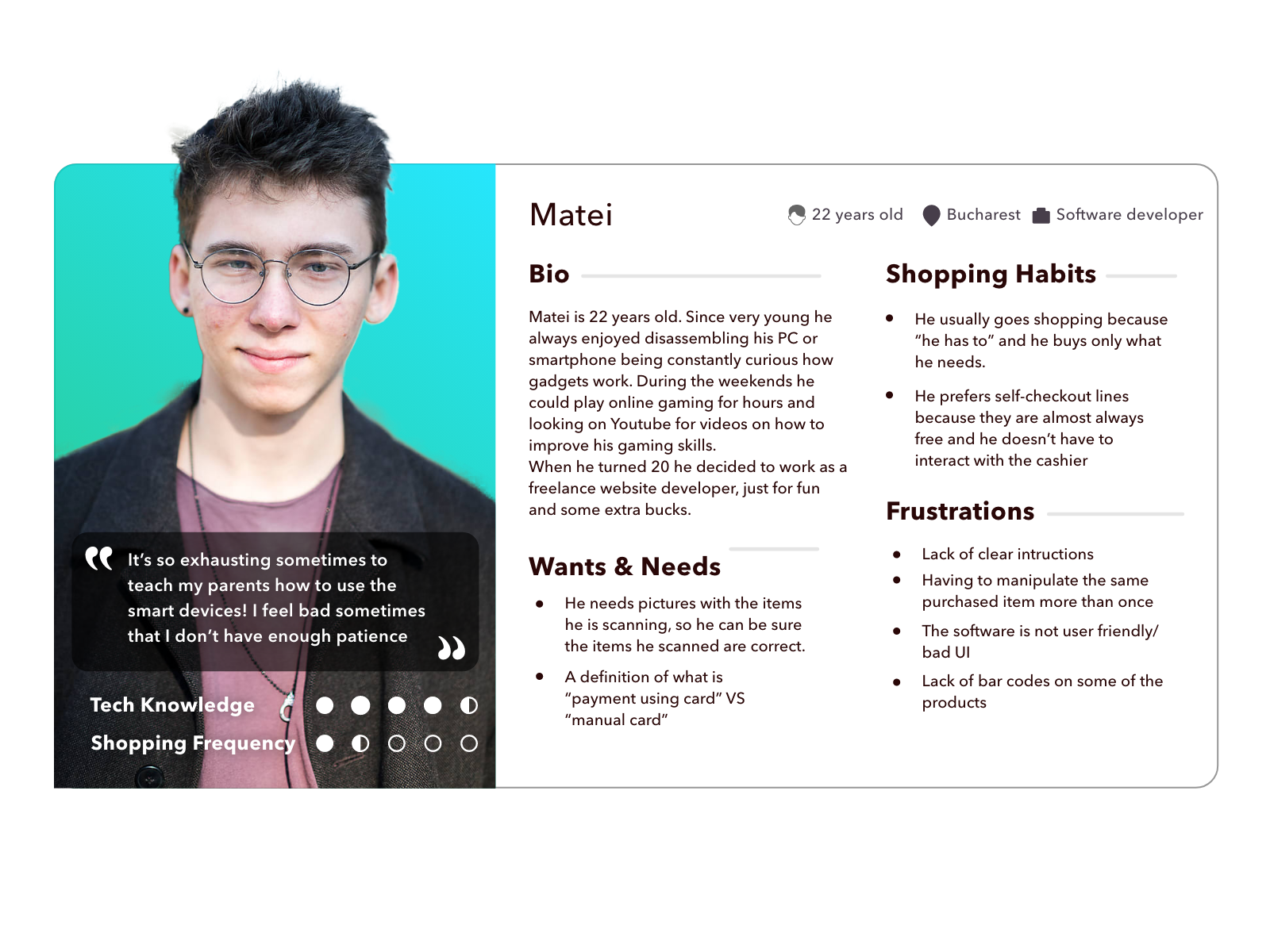
The user journey map was also essential for our research because it helped us have a better understanding of the expectations of our users, which ultimately helped us optimize the customer experience.
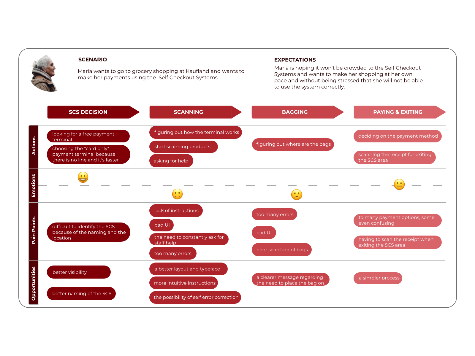
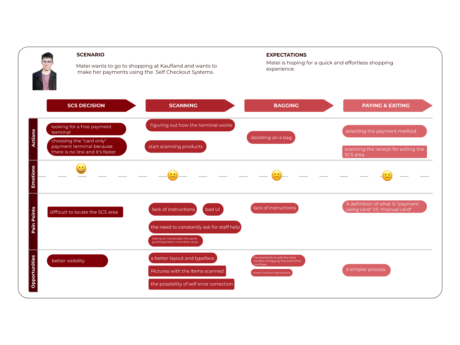
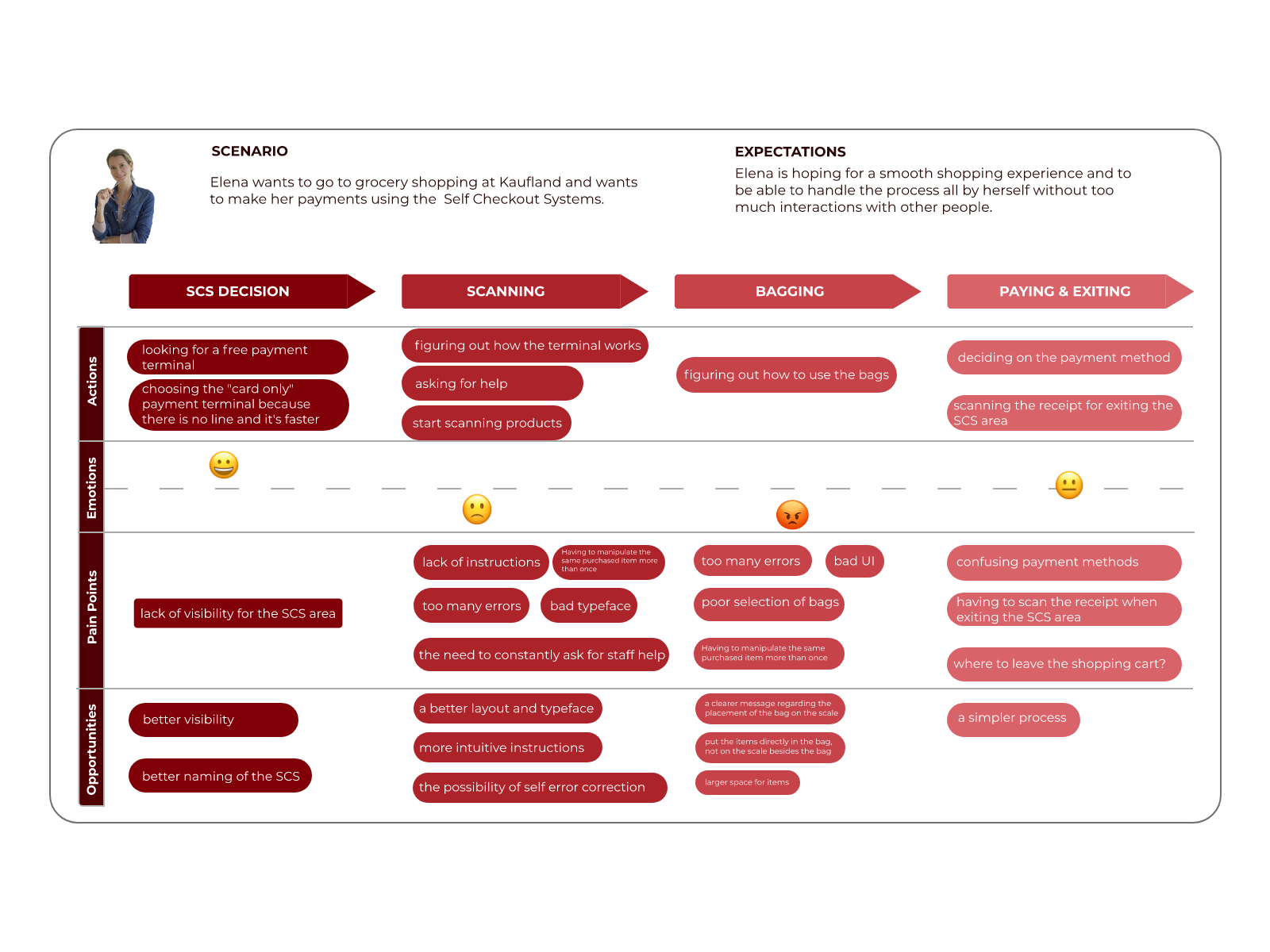
After completing the research, we selected from the data that we collected a few aspects about Kaufland's self-checkout system that needed improvement. The things that needed to be improved were chosen based on what users wanted and what we noticed they needed.

Design
In order to better understand how users navigate through the self-checkout system and to better observe their course of action, I created a user flow. This helped me later, when I created the wireframes and the prototype.

SOLUTION 1
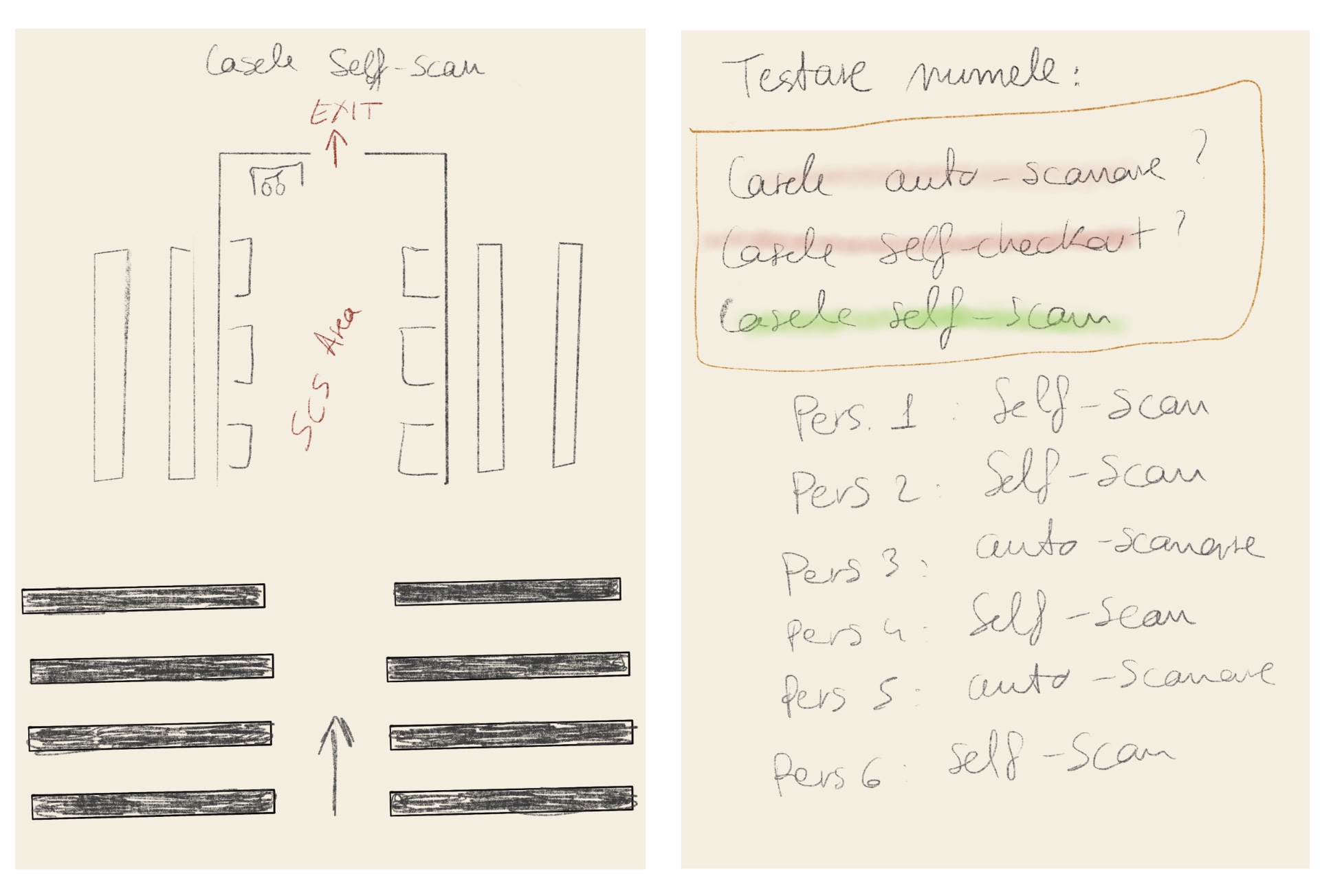
This solution was created for the problem that users had difficulties to identify the Self-checkout system because of the naming and the location. At the moment the name that Kaufland gave to its self-checkout is "Casele Express" and many have complained that this name misleads them into thinking of till with priority or something like that. The location of the SCS is hidden and have to look for it for a bit.
My solution is to change the name in something more intuitive and recognisable like "Casele self-scan" or just "Casele self-checkout". For the location a solution could be moving the self-checkout area in the middle of check-out area (like in the image).
SOLUTION 2
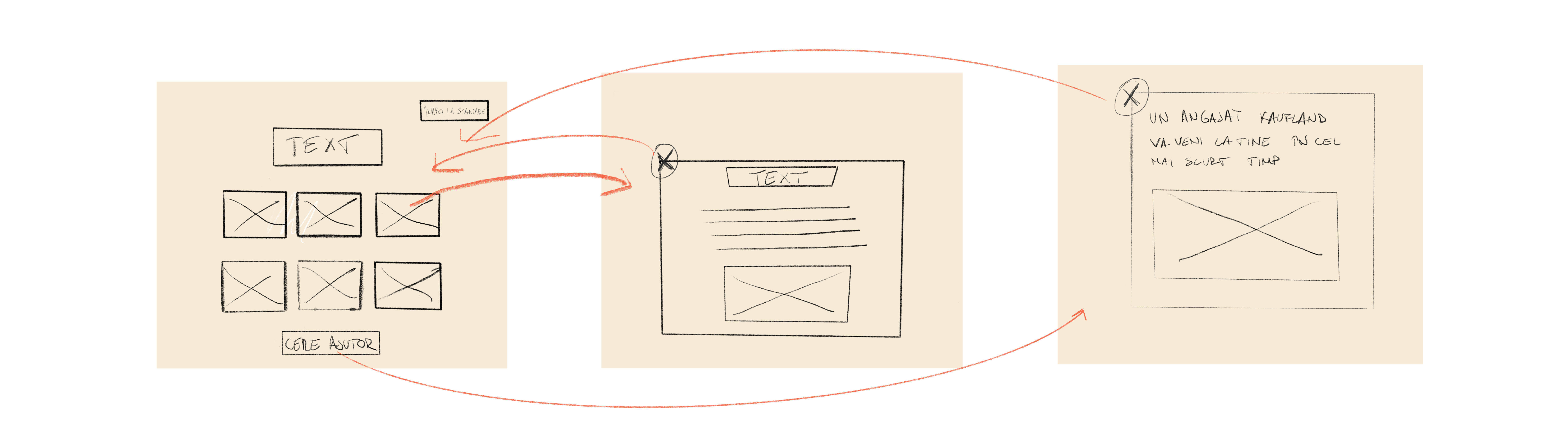
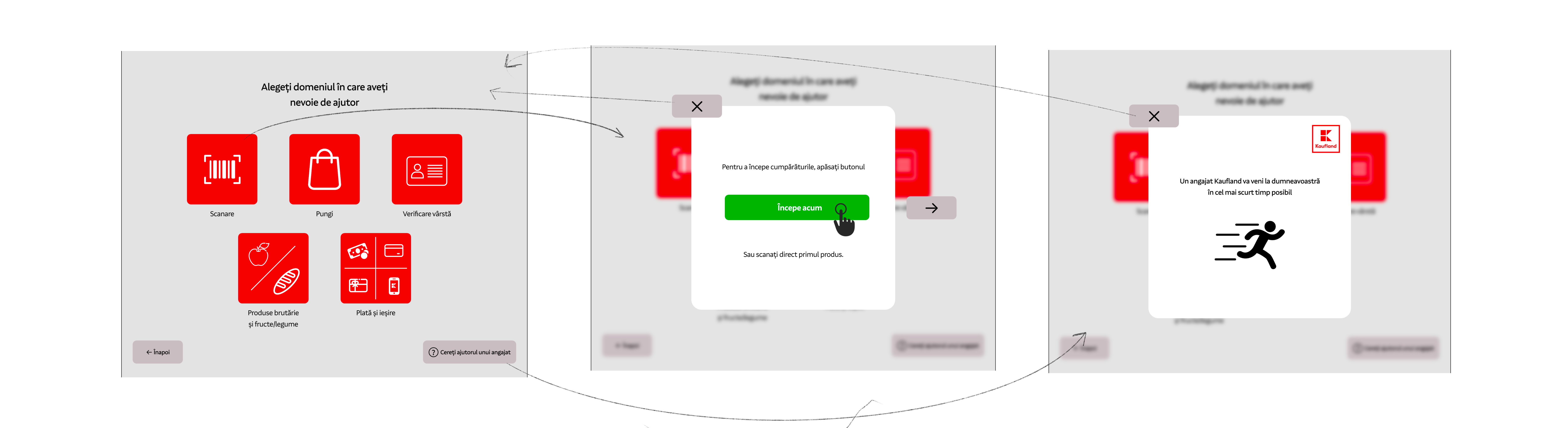
Many of our users told us that one of the scariest thing when you use a self-checkout terminal is the lack of instructions, especially when you are a first-time user. This reminded me of the "Help" button on the SCO menu, which currently only requires the assistance of a Kaufland employee. I think this might turn off some users, who think it's embarrassing not to know how to use the terminal. In addition, one of the business needs was to reduce the interaction between customers and employees.
A solution to this problem would be to create a page which includes the instructions on how to use the self check-out system and which are classified into different categories.
Low fidelity wireframe
High fidelity wireframe
SOLUTION 3
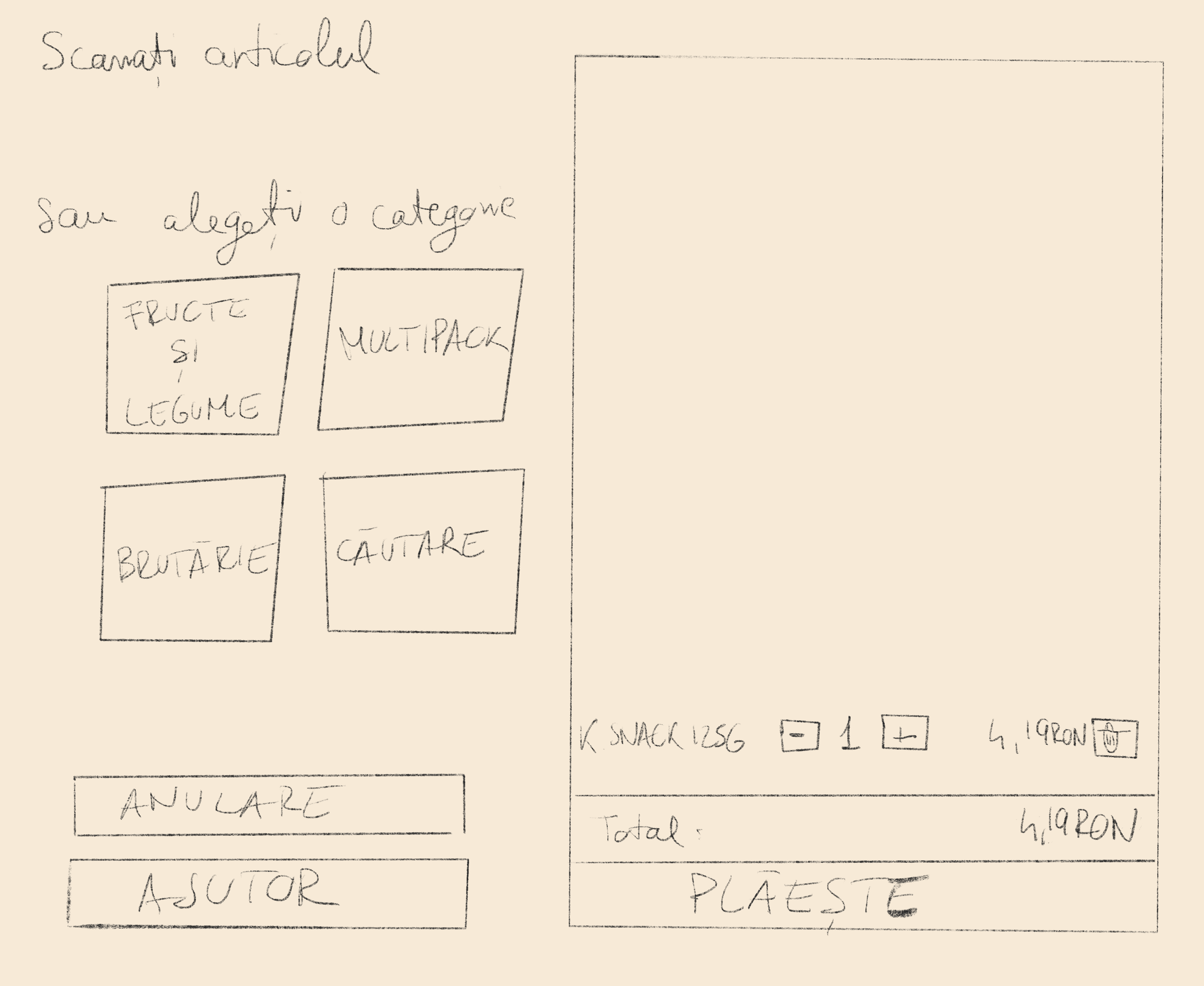
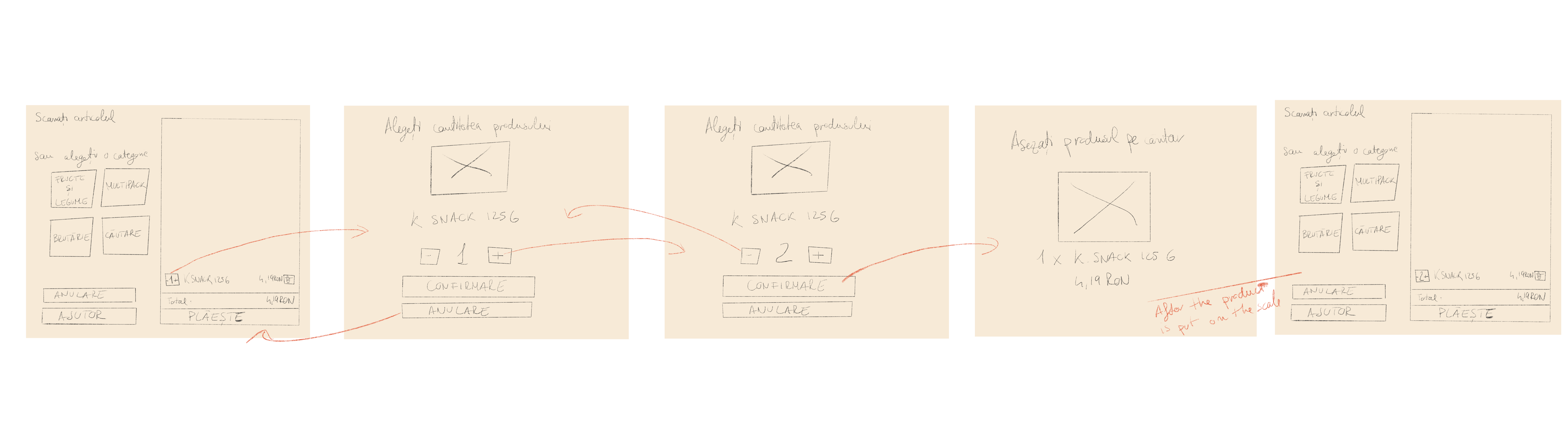
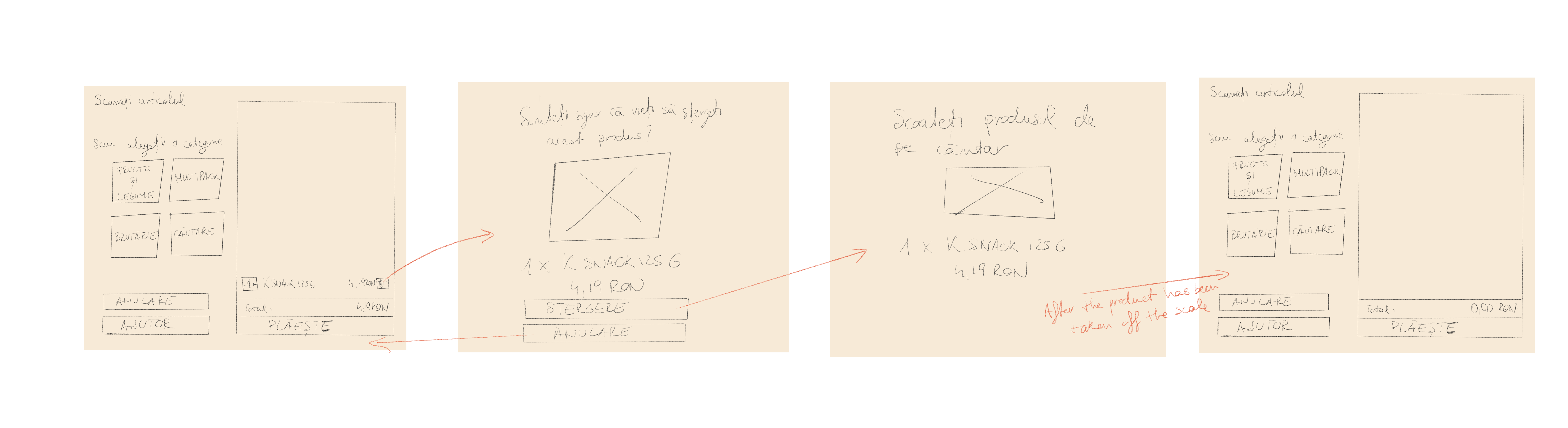
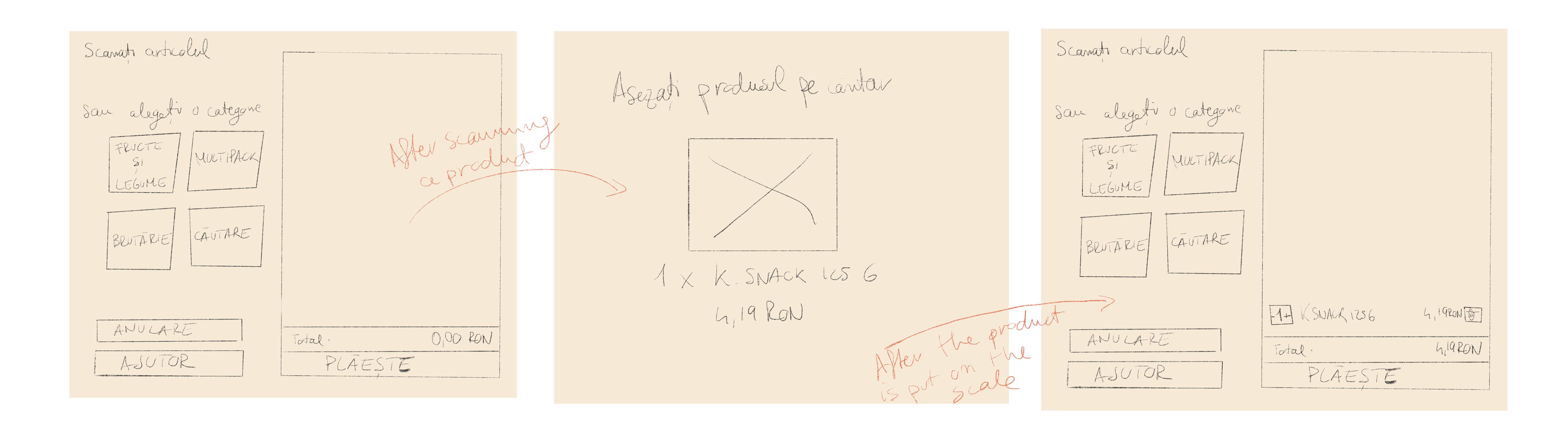
Two of the user needs they told us about were "being able to choose how many products of the same type they had" and the appearance of "an image of the product that has just been scanned". The solutions to these problems were given by the users themselves. I also took into account Kaufland's policy that after scanning the products, the users must place them on the scale.
In the end, I came up with the following solutions:
Low fidelity wireframe
After testing the first wireframe with multiple users, I then created, based on the feedback that I received, a second wireframe.
When you want to change the quantity of a product that has just been scanned:
When you want to delete a product:
When you scan a product:
High fidelity wireframe
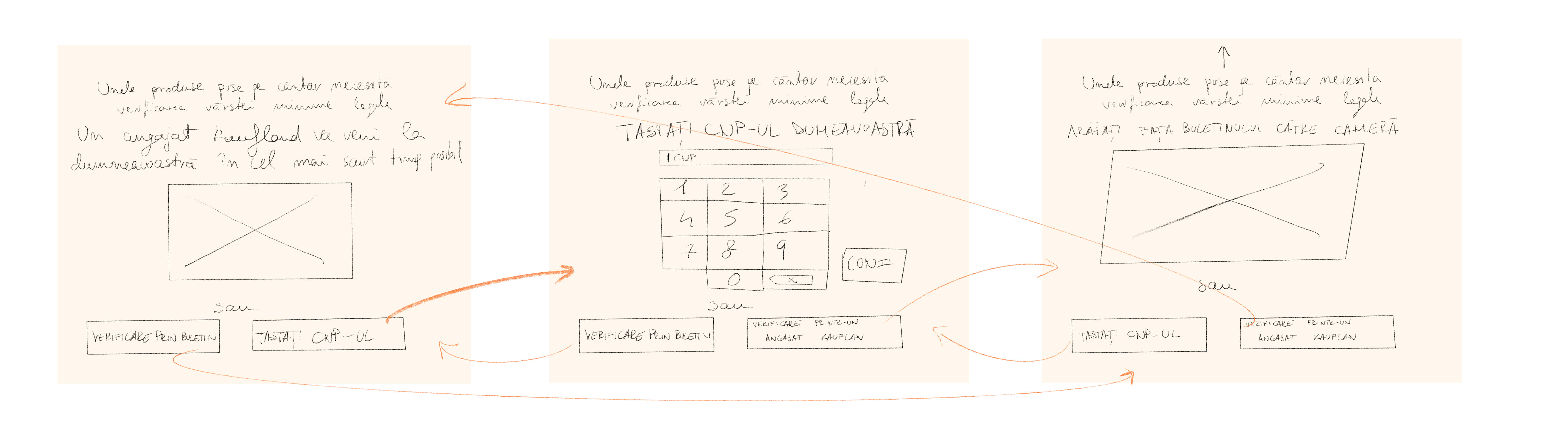
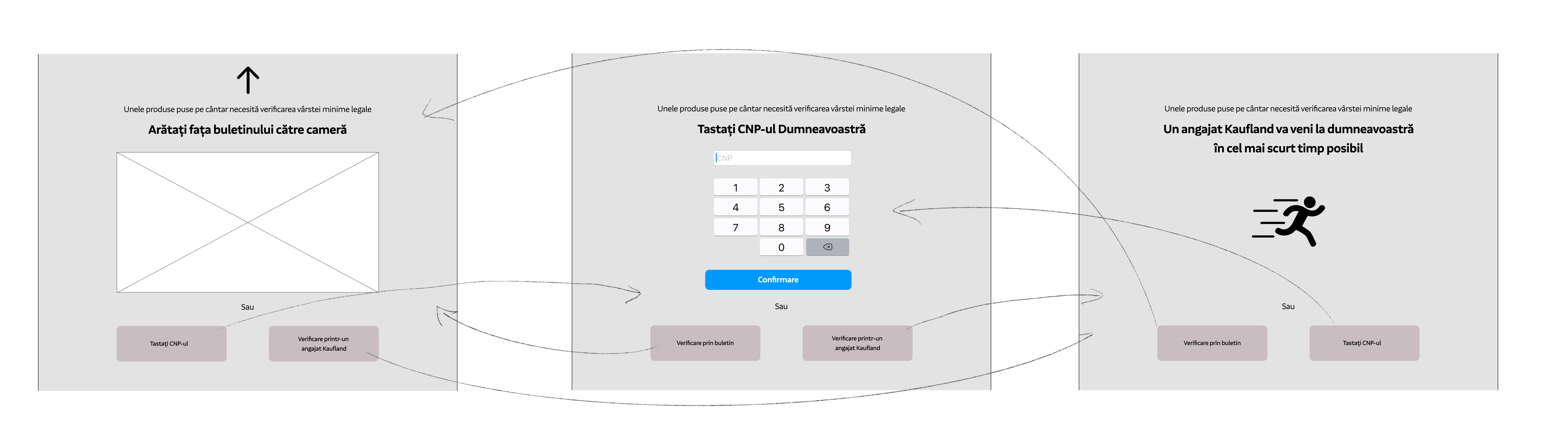
SOLUTION 4
Just as solutions 2 and 3 involved solving the problem of interacting with Kafland staff on almost every action taken, solution 3 runs into essentially the same problem. More specifically, when users buy products that require age validation, they have to wait for a Kaufland employee to do that. My solution gives customers the ability to validate their age by themselves.
Low fidelity wireframe
High fidelity wireframe
OTHER MINOR SOLUTIONS
Another change I made to the current self-checkout was to eliminate one of the payment method: "Card Manual", as it was often confused with the "Card fizic" method.
Another change I made was to increase the size of the buttons and the text, as some of the elderly people couldn't see the icons very well.

High fidelity Prototype
What's next?
- I think this project should be tested by as many users as possible to further improve their experience.
- The desired solutions should be discussed with a team of developers to decide which changes are possible to be made.